
Checking your values better.
because photoshop doesn't work the way you expect.
Mon Mar 04 2019 00:00:00 GMT+0000 (Coordinated Universal Time)
Checking your values is an important step in any artist's workflow, and you should be doing it often. It's especially easy in a digital environment, but Photoshop has a few pitfalls. When I ask artists how they check their values, I overwhelmingly get the same answer. Add a Hue/Saturation adjustment layer to the top of your stack, and DROP. THAT. SATCH. Get that saturation to the floor.
It makes sense, desaturate the colors to get the greyscale value.
But that's wrong! #
Let's compare these two colors, which are CLEARLY different:
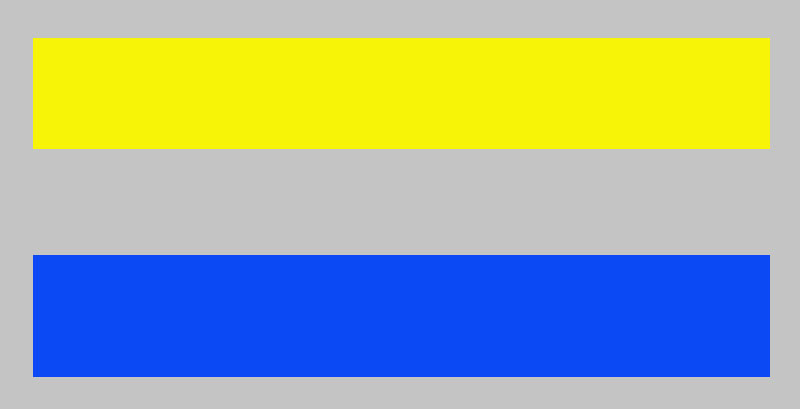
Here is what happens when you desaturate it:

So what the heck happened? #
Photoshop uses the HSB(Hue, Saturation, Brightness) values of a color to inform the Hue/Saturation adjustment layer. The 'brightness' value is considered independent of the relative brightness. Take a look at the color picker information for each of the two colors, paying attention to the 'B' of HSB:
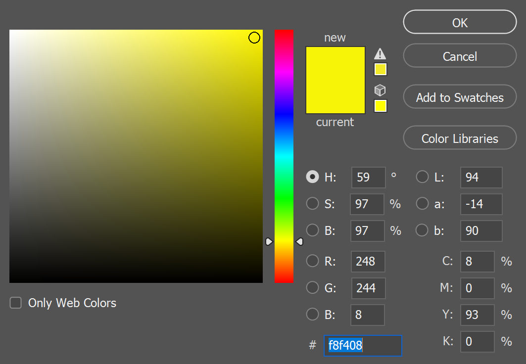
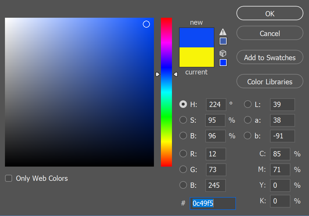
We are consistently getting Brightness values that are within 1% of each other, even though they are definitely different values! Don't get me wrong, HSB is fabulous. It helps me compartmentalize colors into absolute sliders, which is invaluable since I am slightly colorblind. It also isn't that big of an issue for small edits. But we are stripping 100% of the color away to check the value structure! It has to be right.
So what SHOULD I be doing? #
The 'truest' way to strip the color information is to convert the whole canvas to greyscale color mode. It'll discard information in a more informed way, and preserve lightness effectively. But that is destructive, slow, and not a good solution for quick checks. So I have an easier solution.
Fill a new layer at the top of your stack with black. Set the blend mode to 'color'. That's it. #

Bingo. The 'color' blending mode treats color information, and lightness information, as discrete attributes. It's much more similar to how the human eye works, and has a lot in common with LAB color space, as opposed to RGB or CMYK. As far as I can tell, it's most similar to the greyscale color mode without fully commiting to discarding the color info. So as long as you keep the layer at the top, you can toggle it on and off super quickly. Lets look at it in a real world image with lot's o' colors:

And here are the value structures, side by side:
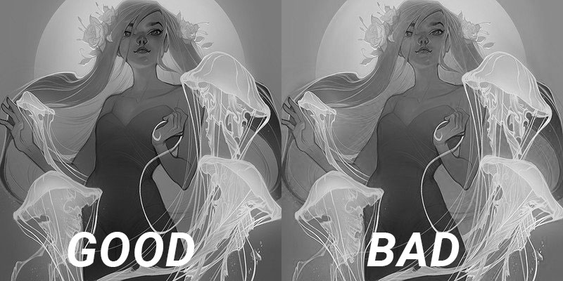
It's a night and day difference. Values are punchy, especially with the lighter, saturated blues. Lights are going to be more appropriately vibrant, and the effect will be especially transparent with blues and yellows. I chose those colors for the demo on purpose. So don't let Photoshop mess you up. These principles are probably applicable in other programs as well. So here is the more general rule of thumb:
Desaturation with HSB values = bad #
Desaturation with LAB lightness = good #
Thanks for reading. 🥰
Back